


Nothing Icon Pack : Line
AlphaOne
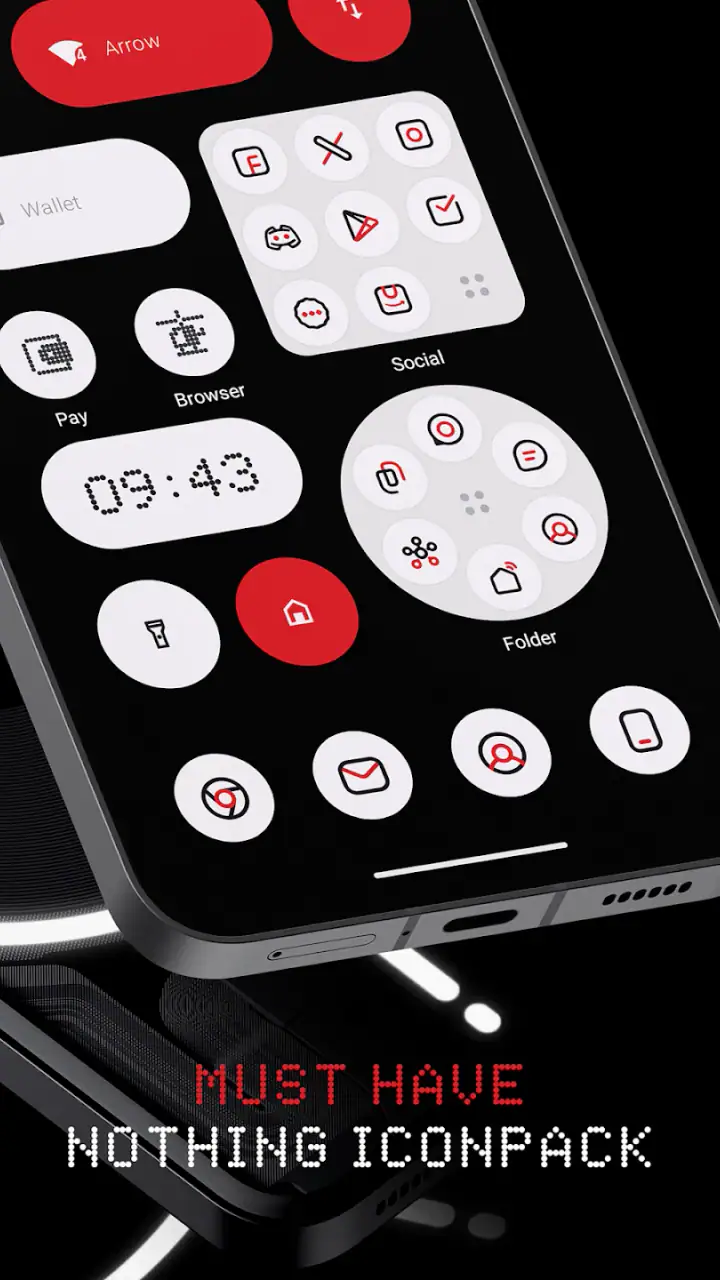
I approached Nothing Icon Pack : Line as a personalization tool rather than a dramatic phone makeover. Its purpose is focused: it gives supported Android launchers a consistent Nothing-inspired visual style, with a large collection of carefully drawn icons. After spending time with it, I think its appeal comes less from novelty and more from discipline. When the rest of the home screen is arranged to match, the result feels calmer, cleaner, and easier to look at.
This is an app from AlphaOne, listed in the personalization category, and it costs $0.99. It is suitable for everyone, works with Android 6.0 and later, and was released on January 27, 2024. The current version is 3.9. Those details make it approachable for older Android users as well as people with newer phones, although the actual experience depends heavily on the launcher installed on the device.
How the icon pack feels in everyday use
The first thing I noticed was that the pack is built around a recognizable visual language instead of simply replacing icons with random monochrome symbols. The line-based treatment gives the home screen a more unified appearance, especially when the wallpaper is restrained and widgets are kept simple. It is a good fit for someone who likes the Nothing phone aesthetic but does not want to change launchers, buy a new device, or rebuild the entire interface from scratch.
The collection contains more than 3,750 icons, which is enough to cover a broad mix of common apps and less obvious utilities. I would still avoid assuming that every icon on a personal phone will have a dedicated design. Icon packs often encounter the same practical problem: a newly installed, regional, banking, work, or manufacturer-specific app may not be included. The useful question is not whether every icon changes, but whether the apps used most often look coherent together.
In my experience, the visual effect is strongest on a first home-screen page containing a manageable number of frequently used apps. If I put every application on one crowded page, the line style becomes less noticeable and the screen starts to feel busy again. A smaller arrangement, paired with a matching wallpaper and a consistent widget style, lets the icons do their job without making the phone look over-designed.
Related News

Why WhatsApp Messenger Still Makes Everyday Communication Feel Easy

Jurassic World: The Game Is the Better Dino Tycoon for Strategic Players

Threads in Real Life: Who Should Join, Lurk, or Leave

How SHEIN Turned Shopping Into an Endless Content Feed

How to Make Fortnite Feel Smarter on Mobile

Should You Switch to Microsoft Outlook on Mobile?
Speed expectations during setup and normal use
An icon pack is not the sort of personalization app I would expect to consume attention every time I unlock the phone. Once the launcher has applied the icons, the everyday interaction is mainly handled by the launcher itself. That means the perceived speed of opening apps, swiping between pages, and returning to the home screen should be judged mostly by the phone and launcher combination, not by the artwork pack alone.
The application feels lightweight in concept because it is focused on icon resources rather than trying to replace the whole interface. I would not install it expecting a new lock screen, a complete settings redesign, or system-wide visual changes. Its narrower scope is actually a benefit for people who want a controlled adjustment. You can change the appearance of the home screen while leaving the rest of Android familiar.
There is one important speed-related expectation to keep realistic: the pack cannot make an older launcher feel modern. If page transitions already stutter, changing icons is unlikely to solve that problem. On a device that already runs smoothly, the pack should be evaluated for how quickly it applies and how consistently the launcher displays the artwork, rather than for any supposed performance boost.
Gallery
What happens when the home screen gets busy
The most demanding moments are not necessarily technically heavy. They are visual and organizational. A home screen with several pages, folders, widgets, and a mixture of themed and unthemed icons can expose the limits of the design more clearly than a simple layout. The line aesthetic looks intentional when the icons share a common treatment; it looks less polished when some apps remain in their original colorful style.
I found that folders are especially useful for keeping the appearance under control. Putting rarely used apps into a few clearly named folders reduces the number of mismatched icons visible at once. This is a practical way to use the pack on a phone with many applications without spending a long time searching for replacements or rearranging every screen.
Another useful approach is to place the most visually important shortcuts on the first page and move exceptions elsewhere. For example, if a work app does not receive the same treatment, I would rather keep it in a second-page folder than let one bright icon dominate an otherwise minimal layout. That is not a feature of the pack itself, but it is the kind of workflow that makes its strengths more apparent.
Resource demands are difficult to separate from the launcher, wallpaper, widgets, and phone hardware. I would not claim that this specific pack changes battery life or memory behavior in a measurable way. What I can say is that its purpose is narrow, and there is no reason to choose it for performance features. Choose it for the visual system; let the device and launcher determine the underlying responsiveness.
Reliability and recovery when an icon does not apply
The biggest reliability question with any icon pack is compatibility. The pack has to be recognized by the launcher, and the launcher has to support applying third-party icon packs. On a compatible setup, the process should be straightforward: select the pack through the launcher’s icon or theme settings, apply it, and review the result. On a launcher without that support, the quality of the artwork does not matter because the central function is unavailable.
This is why I would check the launcher before paying for the app. The $0.99 price is modest, but it is still frustrating to purchase a personalization tool and discover that the phone’s default launcher does not offer the required option. A compatible third-party launcher may solve that problem, but installing one introduces another layer of settings, home-screen behavior, and possible migration work.
Recovery is usually more reassuring with icon packs than with deeper customization tools because the original launcher arrangement is not the same as replacing the operating system. If the result is not right, I would first return to the launcher’s default icon set, then check whether only certain apps remain unchanged. If the whole pack fails to appear, I would look at launcher compatibility rather than repeatedly reinstalling the app.
Keeping a note of the previous home-screen arrangement is a sensible precaution before making any major visual change. This matters less for someone with a simple layout, but it helps if the phone contains carefully placed folders and widgets. The pack itself is not a reason to accept a messy recovery process; the safest approach is to change one layer at a time and confirm the launcher behaves as expected.
How the current version fits older and newer phones
Support for Android 6.0 and later gives this app a broad potential audience. That is useful for owners of older phones who want a visual refresh without replacing their device. However, operating-system compatibility does not guarantee identical behavior across manufacturers. Samsung, Xiaomi, Motorola, and other Android brands may expose personalization settings differently, and some default launchers are more open to icon packs than others.
On a newer phone, the main constraint is likely to be ecosystem preference rather than raw hardware. A powerful device can still have a launcher that limits third-party icon packs. Conversely, an older phone may handle the pack perfectly well if its launcher supports it and the home screen is not overloaded with animated widgets or elaborate effects.
I also think the age rating matters for families choosing a simple appearance change. The app is rated for everyone, and its purpose is visual customization rather than communication, entertainment, or content discovery. Parents should still consider the launcher being used alongside it, because the icon pack does not define the broader behavior of the phone.
The current version is 3.9, and the release date is January 27, 2024. I mention those details because they help place the app in context: this is an established version of a focused personalization product, not a claim that it transforms every part of Android. I would judge it by the quality and consistency of the icon treatment, plus whether it works with the launcher already on the phone.
Where it compares well with ordinary alternatives
The usual alternative is to keep the default icons and change only the wallpaper. That is faster and costs nothing, but it rarely creates the same level of visual consistency. A wallpaper can set a mood; it cannot make unrelated app icons share a design language. This pack is the better choice when the goal is a deliberate monochrome or line-art home screen rather than a quick background change.
Another alternative is a complete launcher theme. That can offer more control over grids, gestures, widgets, folders, and transitions, but it also creates more decisions and more opportunities for something to feel unfamiliar. I prefer this icon pack for a smaller intervention. It lets me keep the launcher’s normal behavior while changing one of the most visible parts of the interface.
Manual icon replacement is the most flexible option for people who want absolute control. It can handle individual exceptions and unusual apps, but it is slow and tedious across a large app library. With more than 3,750 icons in the collection, this pack is more practical for someone who wants broad coverage without editing every shortcut by hand. The trade-off is that the finished result depends on which apps are covered and how the launcher handles missing icons.
There is also a difference between a line icon pack and a full Nothing-style setup. The icons can contribute strongly to the look, but they do not automatically create matching widgets, wallpapers, notification panels, or system menus. If you want the entire phone to resemble a particular device interface, a broader theme or launcher solution may be more satisfying. If you mainly want the home screen to look less fragmented, this focused approach makes more sense.
A realistic daily scenario
Imagine checking a phone during a busy morning. The first page contains a calendar, messages, maps, music, email, and a few work shortcuts. With the line treatment applied, the page feels less like a collection of separate brand logos and more like one surface. I can identify the apps by position and shape, while the reduced color contrast keeps the screen from demanding attention before I am ready to use it.
Later, I install a specialized service app whose icon remains unchanged. Rather than treating that as a failure, I would move it into a folder with other occasional tools. The main page keeps its visual rhythm, and the exception remains available when needed. This is a small but important trade-off: the pack works best when I organize around its coverage instead of expecting it to erase every difference automatically.
For someone who changes wallpapers frequently, the pack may also provide a stable visual anchor. The icons remain part of the phone’s identity while the background changes. On the other hand, if I enjoy colorful icons and use them as quick visual cues, the line style could make some apps less immediately distinctive. Minimalism is not automatically better for everyone; it changes how the screen communicates information.
Who should use it and who should skip it
I would recommend it to Android users who like restrained interfaces, want a Nothing-inspired home screen, and are comfortable checking launcher support before buying. It is particularly suitable for someone who wants a low-cost visual adjustment rather than a complete redesign. The large icon collection is valuable for people with many everyday apps, provided their launcher can apply third-party packs.
I would be more cautious recommending it to users who depend on the default launcher of a phone known for limited customization. I would also skip it if I wanted every application, widget, and system screen to share one complete theme. In that situation, a full launcher or manufacturer-supported theme would probably deliver a more unified result.
It is not the right pick for someone who expects installation alone to reorganize the phone. The best outcome requires a little curation: selecting a suitable wallpaper, reducing clutter, grouping exceptions, and deciding whether the first page should prioritize appearance or instant recognition. That effort is not excessive, but it is part of the product’s real value.
My performance and value verdict
With an average rating of 4.6 from around 250 ratings and more than 10,000 installs, the app has found a clear audience, though those figures should not be mistaken for a guarantee that it will suit every launcher. My own judgment is that the pack is strongest when treated as a precise visual layer. It does not need to be ambitious to be useful.
At $0.99, the decision is relatively easy for someone already interested in this specific style. The price feels reasonable when the launcher applies the icons cleanly and the common apps on the phone are covered. It feels less worthwhile if compatibility is uncertain or if the user wants extensive controls beyond icon appearance.
In terms of perceived speed, I would not buy it expecting faster navigation. In terms of stability, the important variable is the launcher and the device environment. In terms of recovery, returning to the previous icon set should be the first step if the appearance is inconsistent. Those are modest claims, but they are the honest way to assess a personalization app without confusing visual polish with system performance.
My final recommendation is simple: choose this pack for a cleaner home screen, not as a performance upgrade. If you like line-based icons, use a compatible launcher, and are willing to tidy the first page around the design, it offers a convincing change for very little money. If you need complete system theming, guaranteed coverage for every app, or a launcher that works exactly like the default one, another route will serve you better.
FAQs for Nothing Icon Pack : Line
What is Nothing Icon Pack: Line?
Nothing Icon Pack: Line is a minimalist icon customization pack inspired by Nothing’s distinctive visual style. It replaces supported app icons with clean, outlined designs that typically use simple shapes, thin lines, and a monochrome appearance. It is intended for users who want a more consistent, modern home screen rather than colorful, individually styled icons.
Which devices and launchers are compatible with Nothing Icon Pack: Line?
Compatibility depends mainly on the launcher installed on your Android device, not only on the phone model. The pack generally works with popular third-party launchers that support icon packs, such as Nova Launcher, Lawnchair, Smart Launcher, and similar options. Some manufacturer launchers may not support external icon packs, so checking your launcher’s customization settings before downloading is recommended.
How do I apply Nothing Icon Pack: Line after installing it?
After installation, open the icon pack application and look for an Apply, Set, or similar option. You may then choose a compatible launcher from the available list. If your launcher is not detected, open the launcher’s settings manually, find the icon or appearance section, and select Nothing Icon Pack: Line. The exact steps can vary depending on your launcher and Android version.
Does Nothing Icon Pack: Line include icons for every application?
No icon pack can guarantee coverage for every app, especially when it includes newly released, regional, or less popular applications. Nothing Icon Pack: Line may provide themed icons for many commonly used apps, while unsupported icons can remain unchanged or appear with a generic design. Some launchers also allow users to request missing icons or manually edit individual app icons.
Is Nothing Icon Pack: Line free, and does it affect phone performance?
The price and availability may vary according to the store listing and region, so users should review the current download page before installing. An icon pack normally has little effect on performance because it mainly changes visual assets, although a launcher may use additional memory to load custom icons. It does not usually change the phone’s core functions, system speed, or battery behavior significantly.
Pros
- Clean line-based icons give home screens a modern
- minimalist appearance.
- Works well with dark and light wallpapers without overwhelming the layout.
- Large icon coverage keeps most popular apps visually consistent.
- Simple style makes it easy to combine with widgets and custom wallpapers.
- Lightweight design has little impact on everyday launcher performance.
Cons
- Some lesser-known apps may still display their original icons.
- The monochrome look can make certain apps harder to recognize quickly.
- Requires a compatible launcher for applying icons manually.
- Limited customization may disappoint users wanting colorful icon options.
- Icon updates may not arrive immediately after new apps are released.


